


Are you used to and fond of the familiar PinToMind Classic but are considering switching to PinToMind 3? Get inspired here - and go for it! PinToMind 3 is truly fantastic!
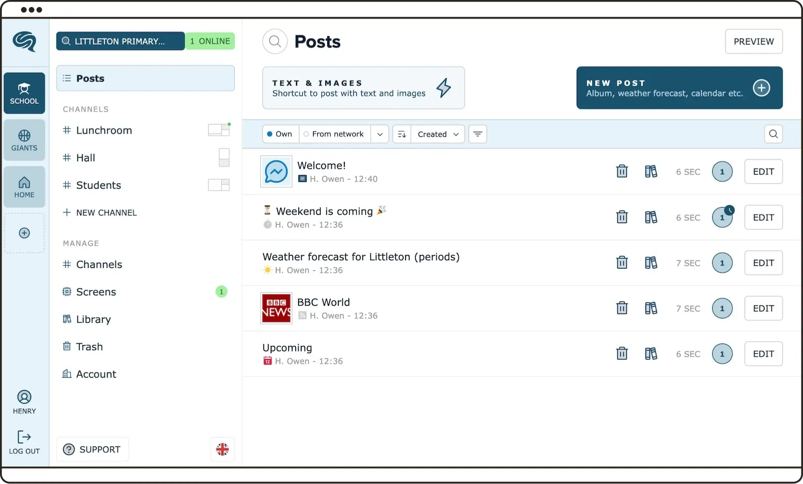
Get ready to log in to PinToMind 3! It's easier than ever to navigate. The new and improved design gives you a fantastic overview right from the start. And amidst all the new features, you'll still find a lot that feels familiar.
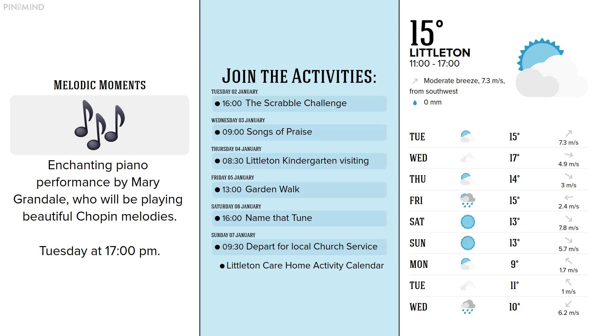
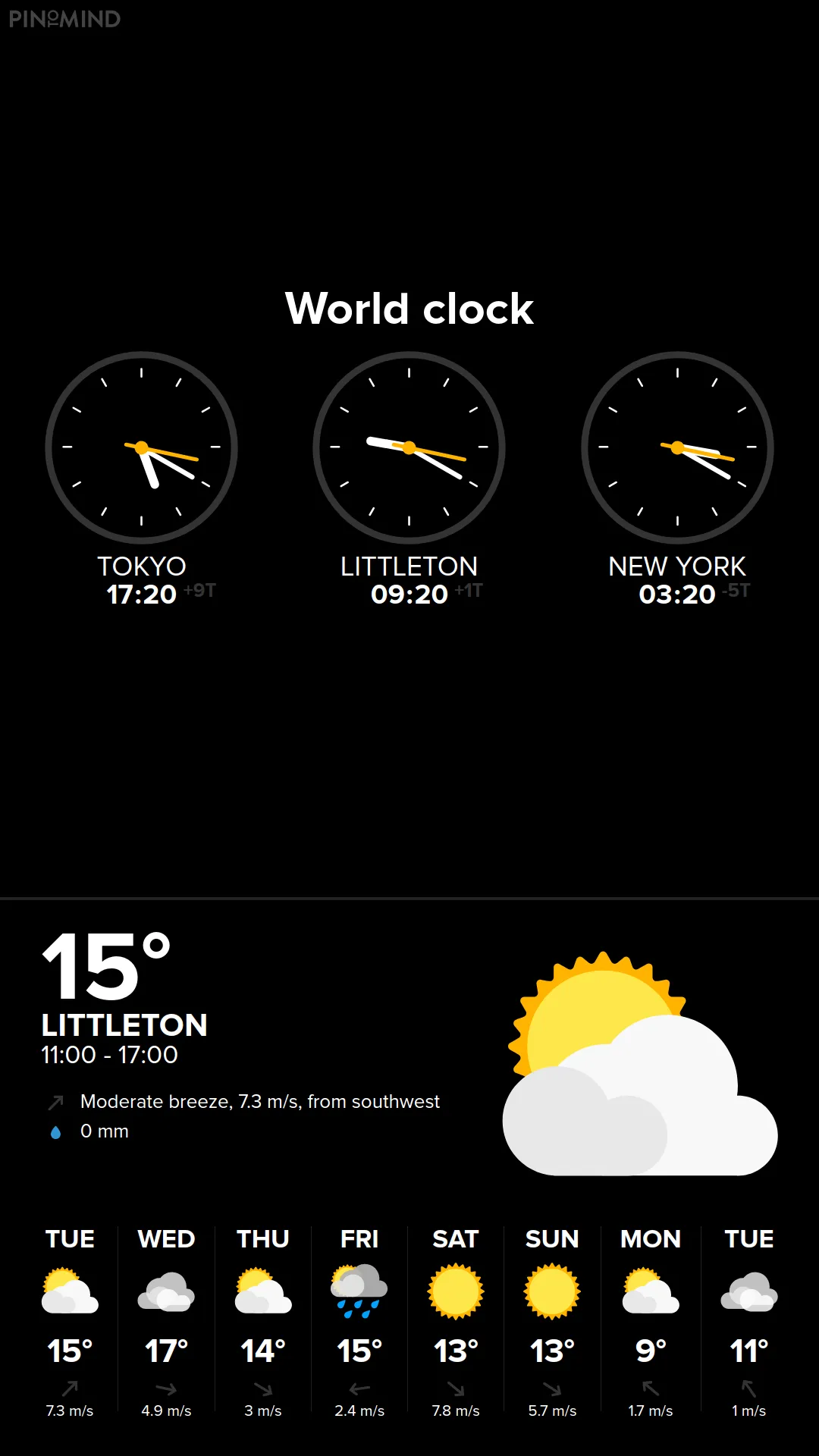
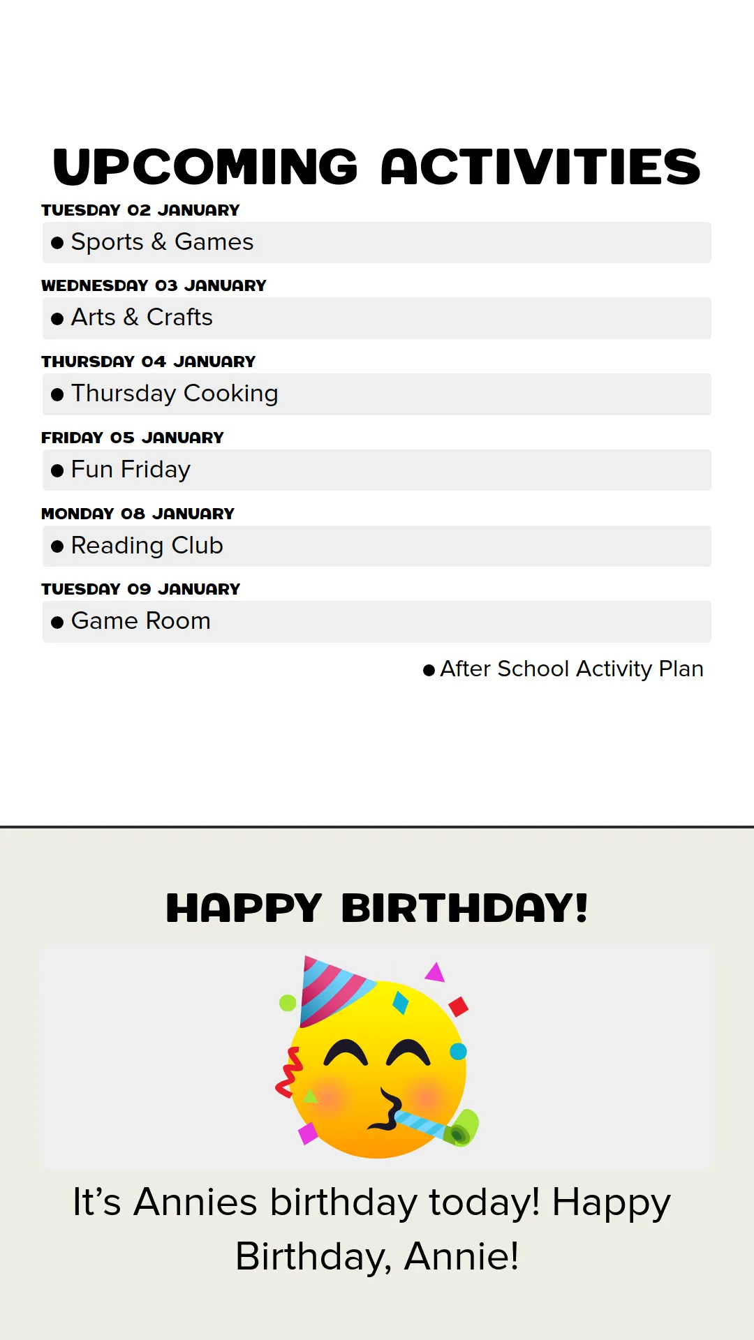
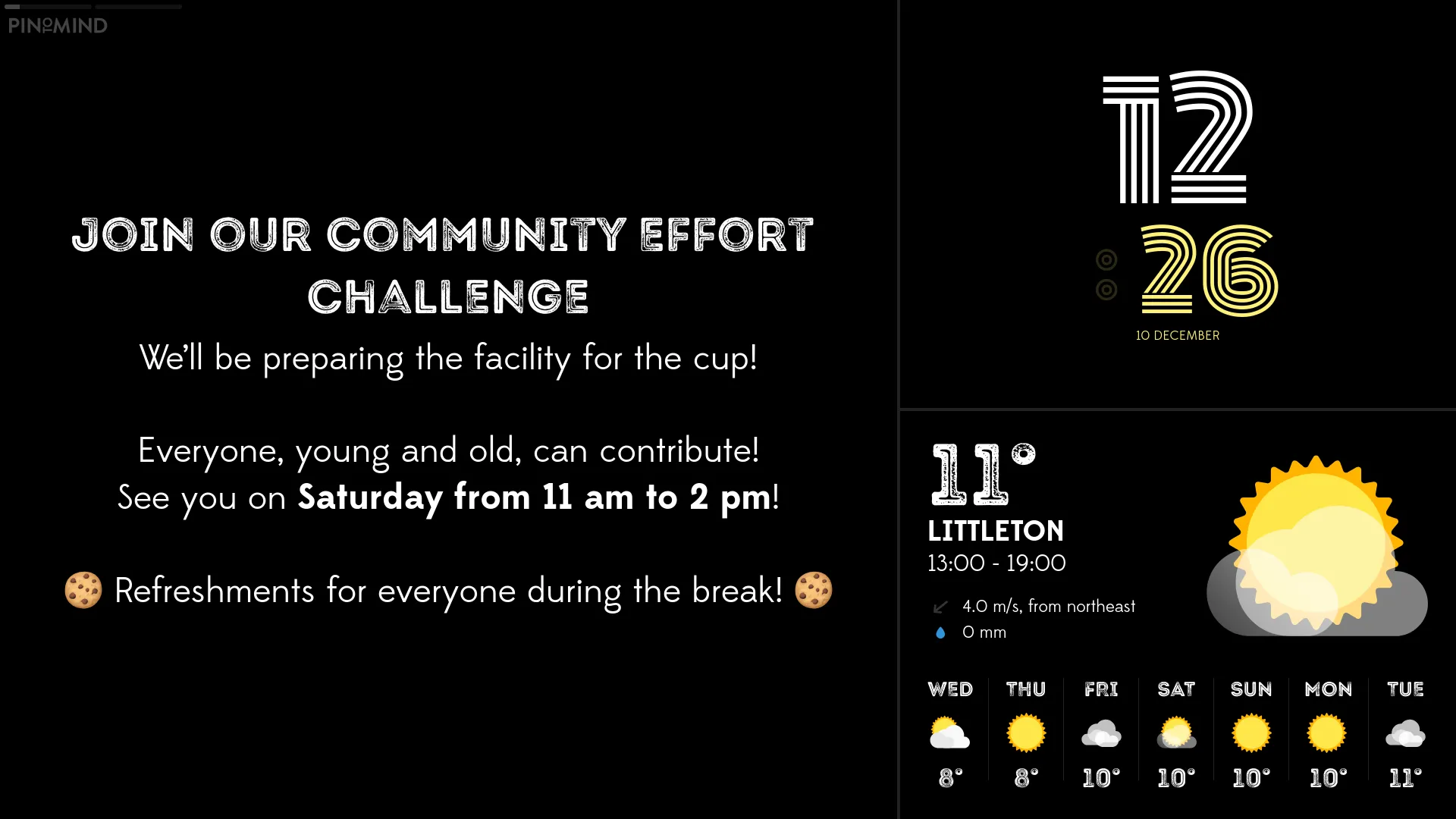
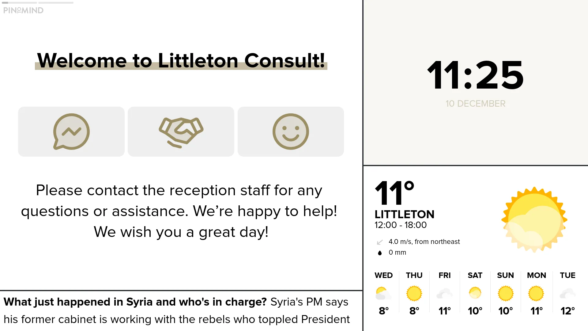
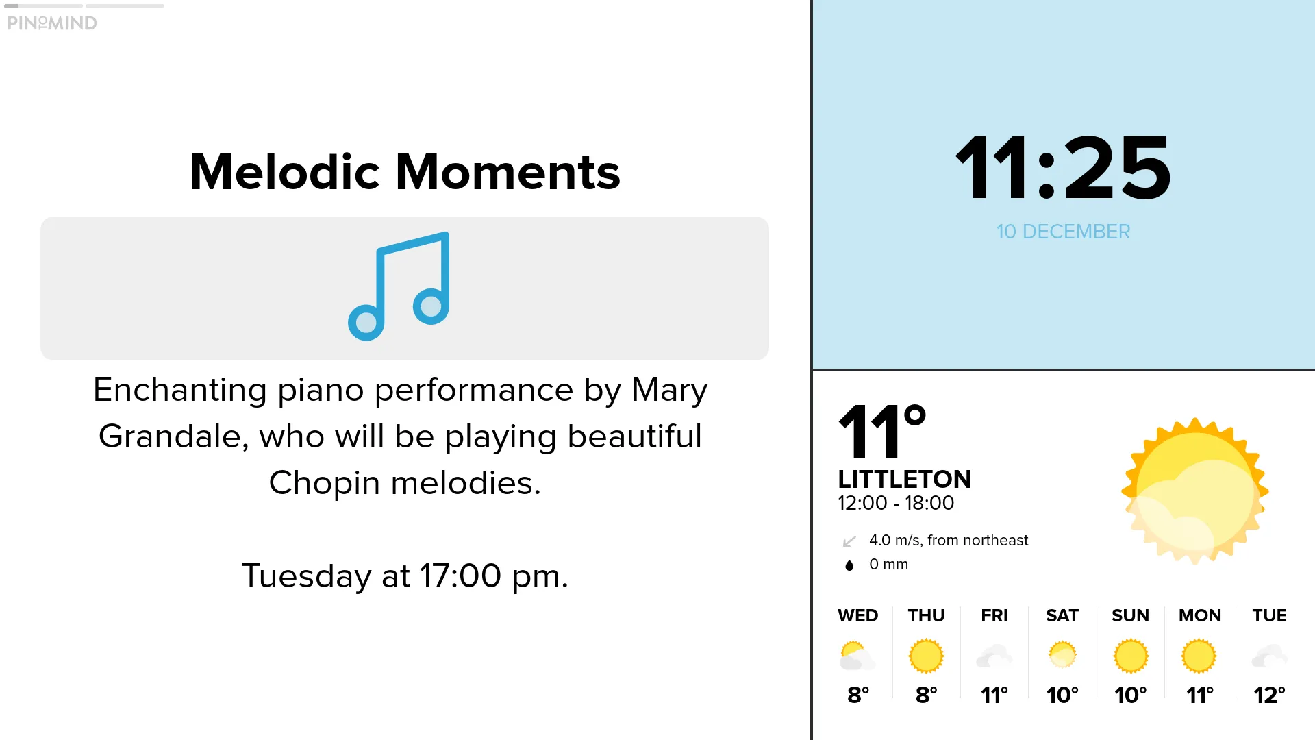
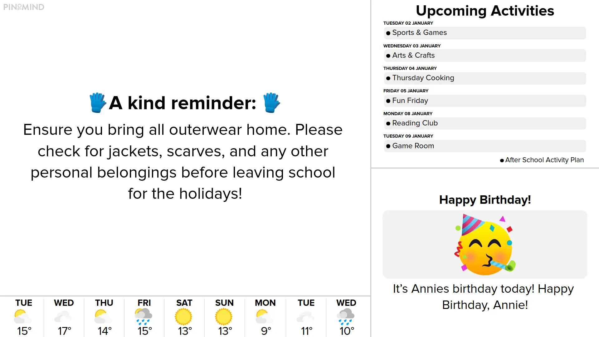
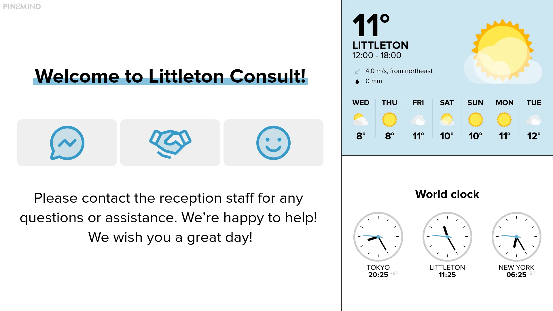
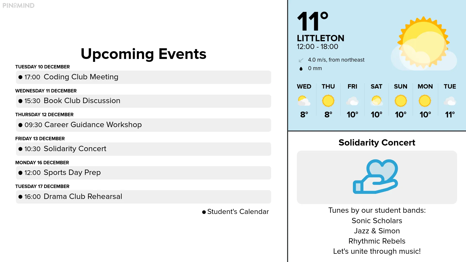
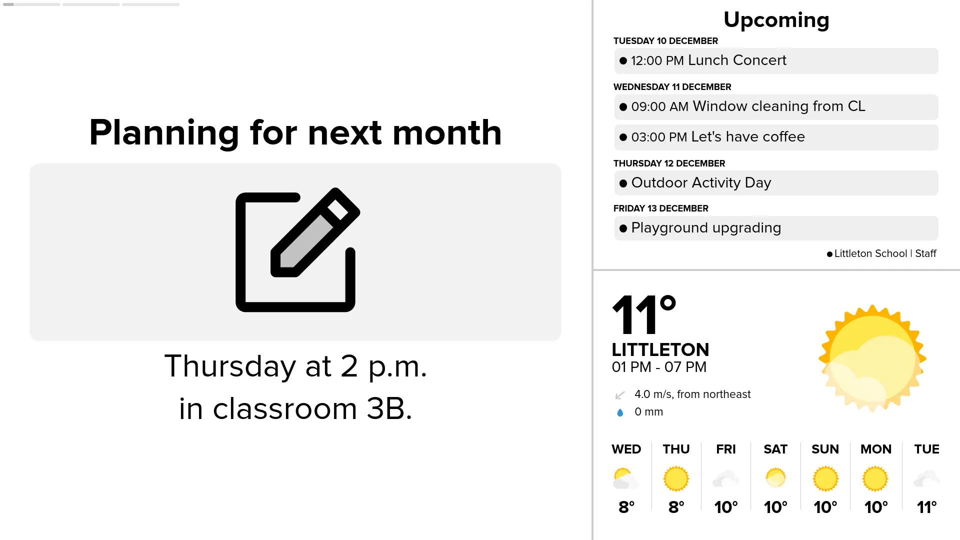
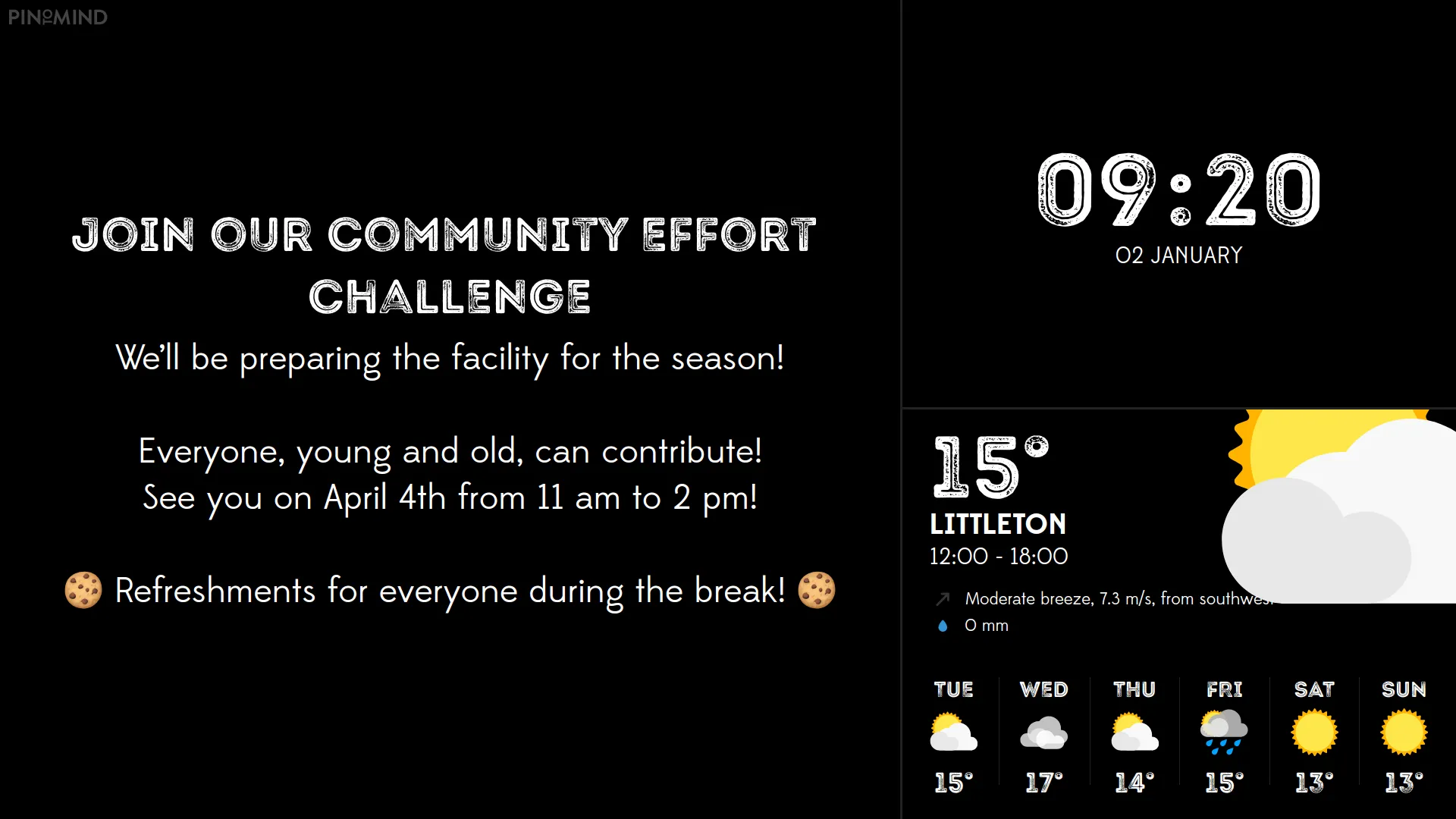
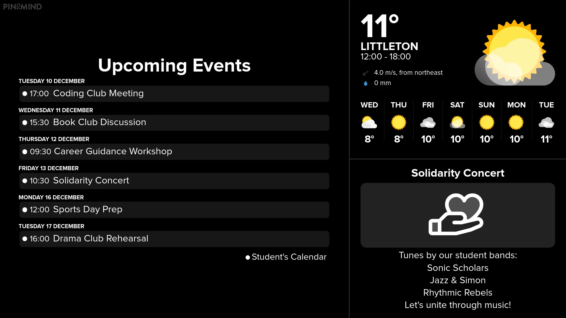
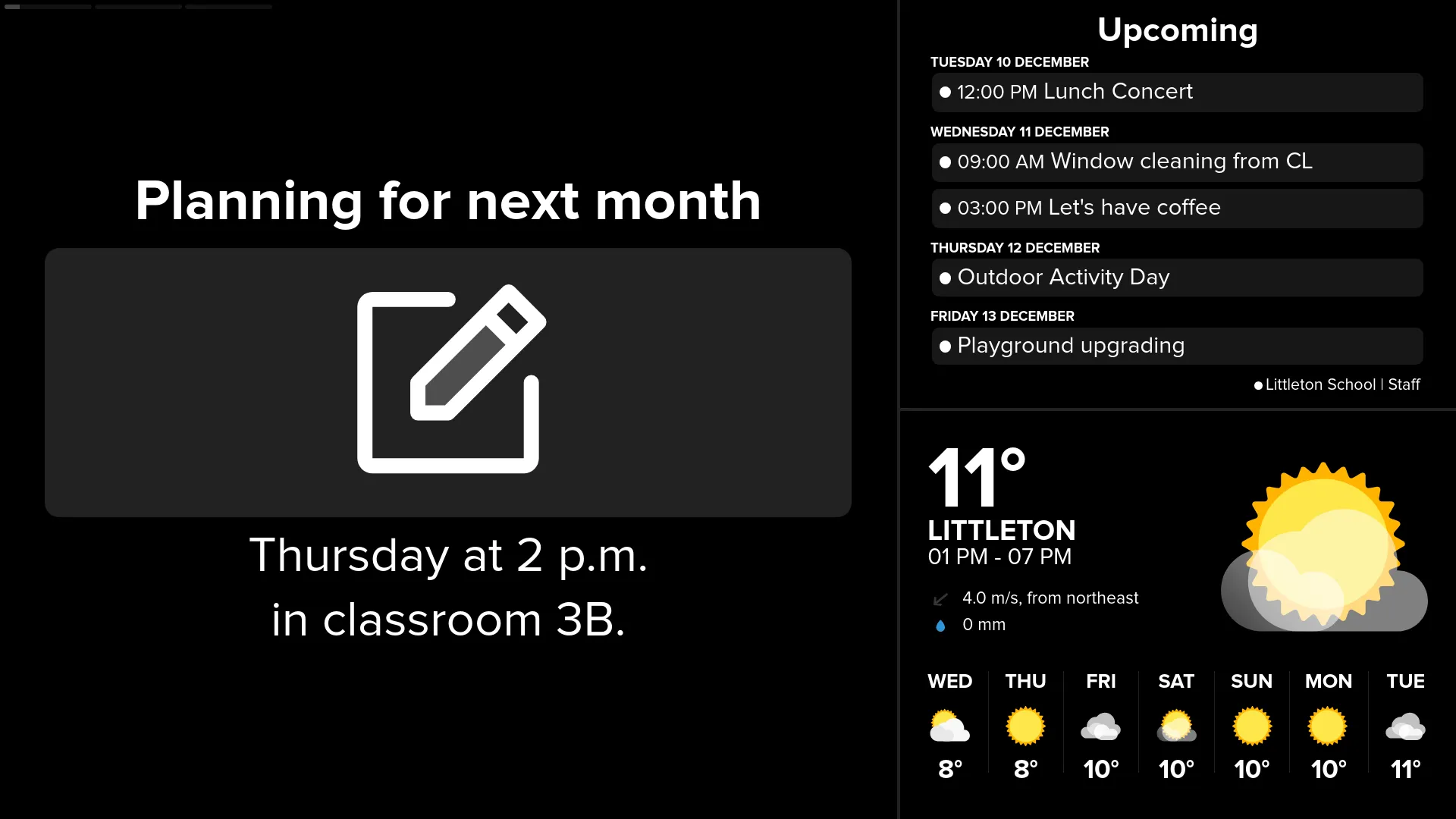
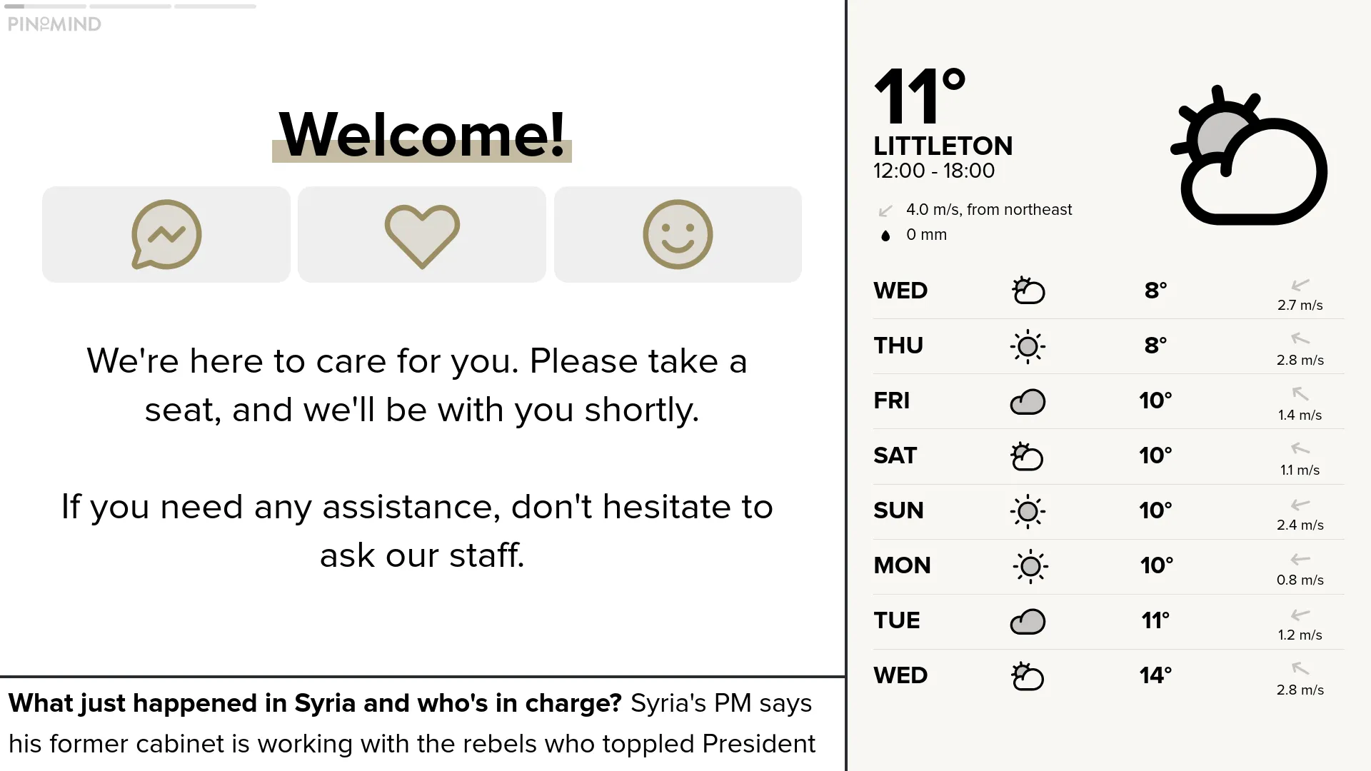
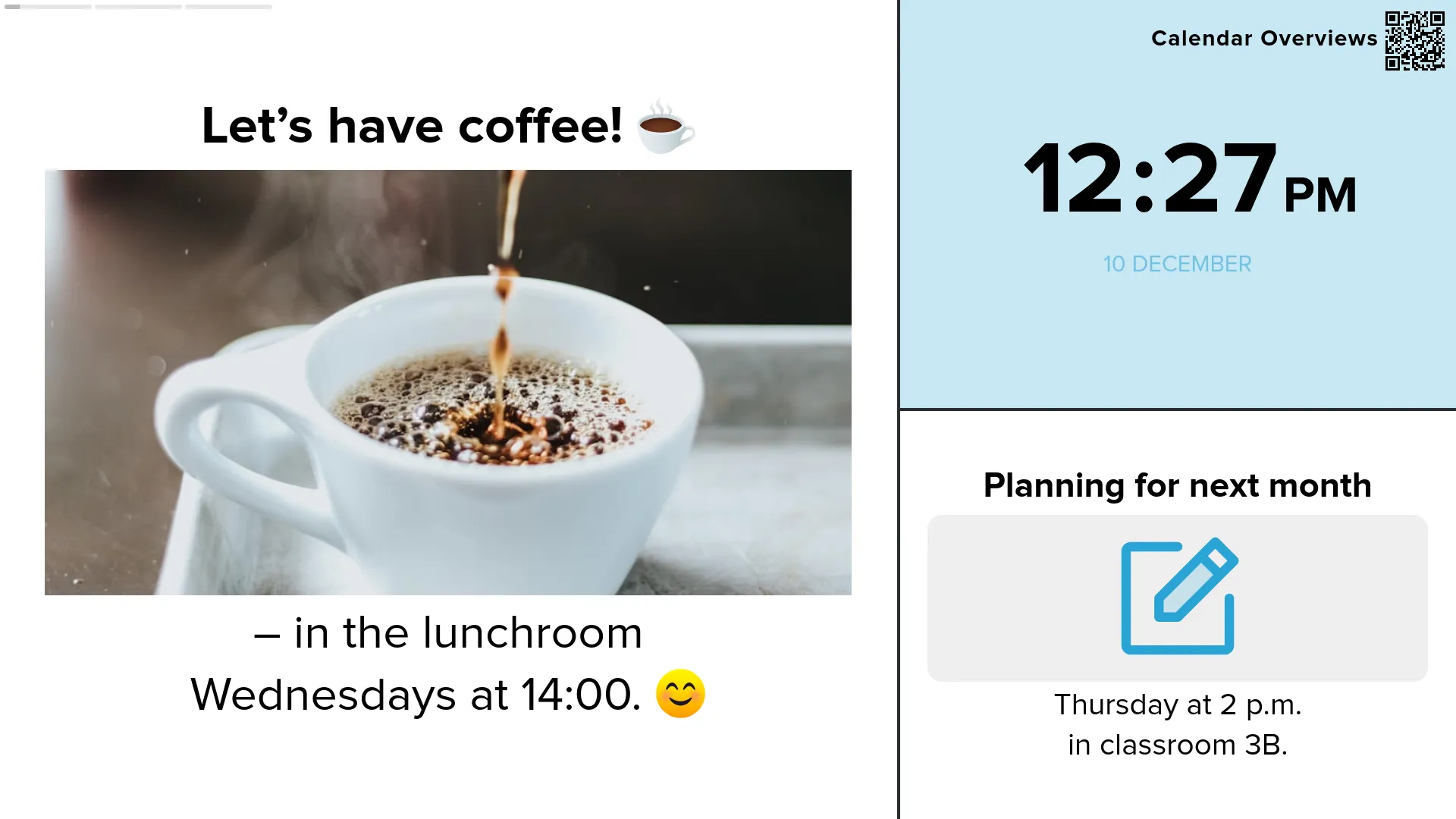
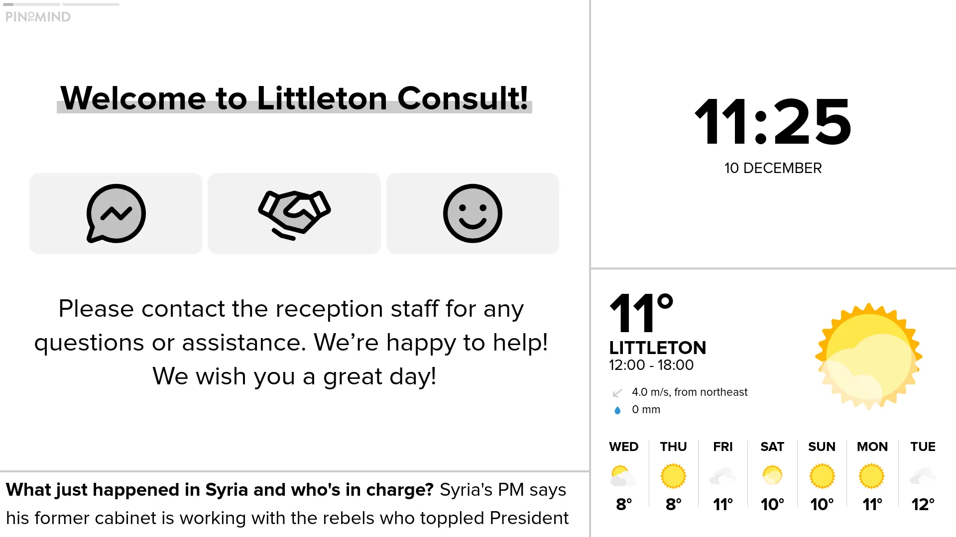
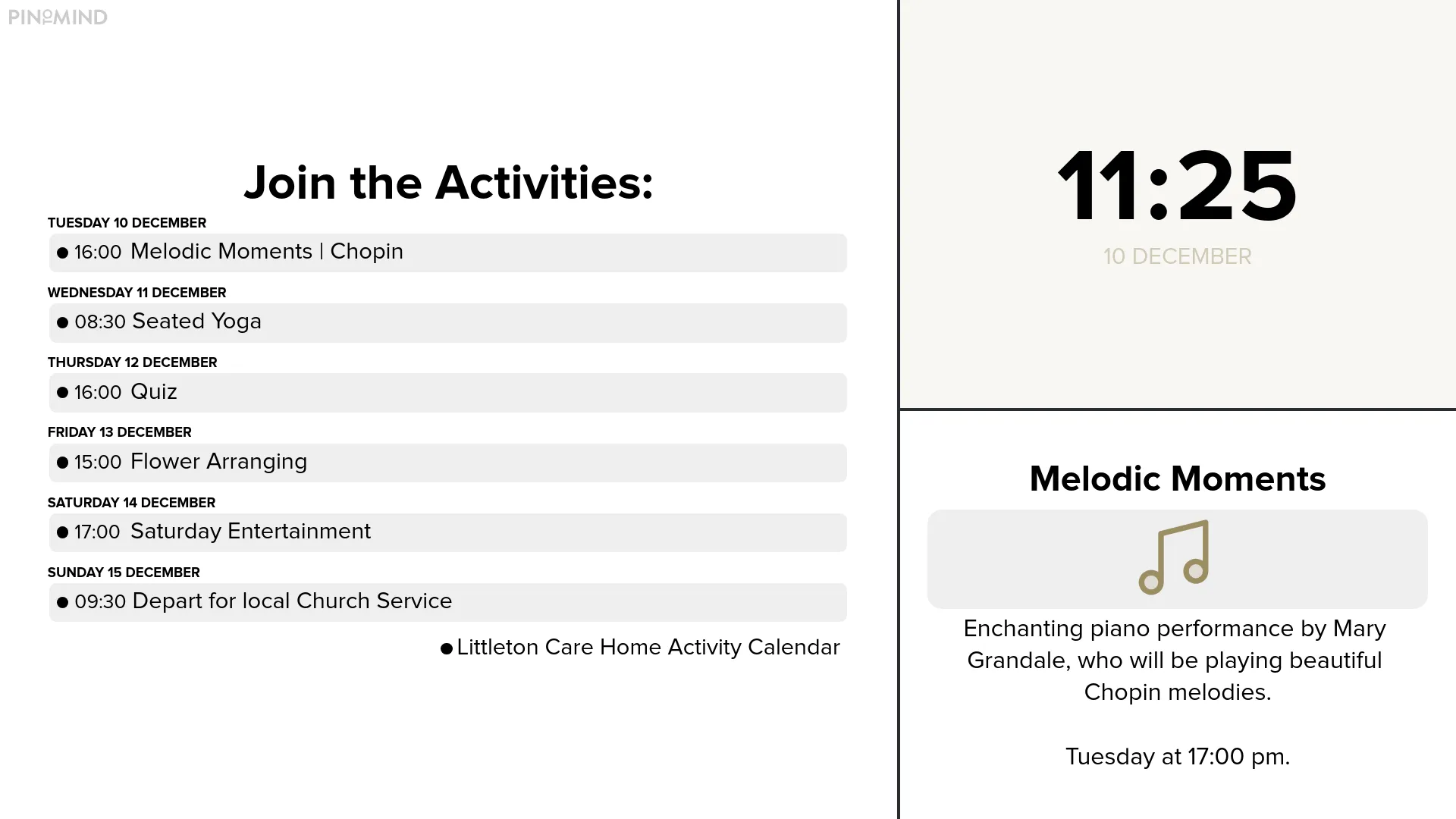
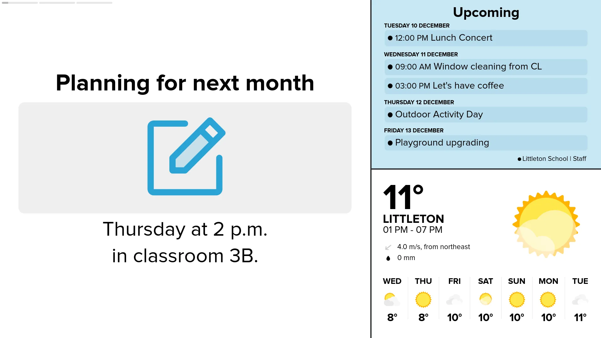
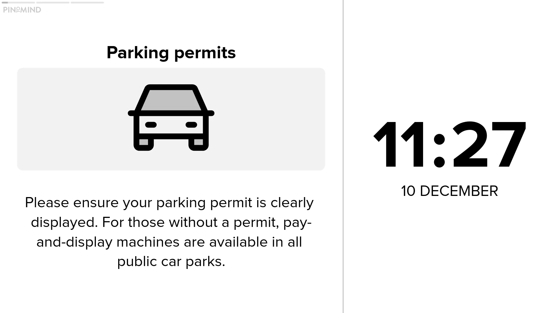
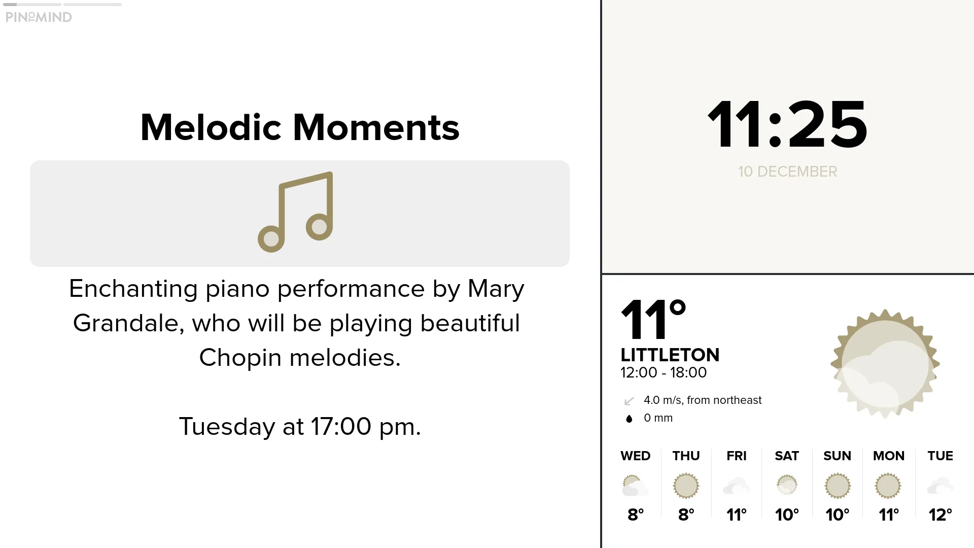
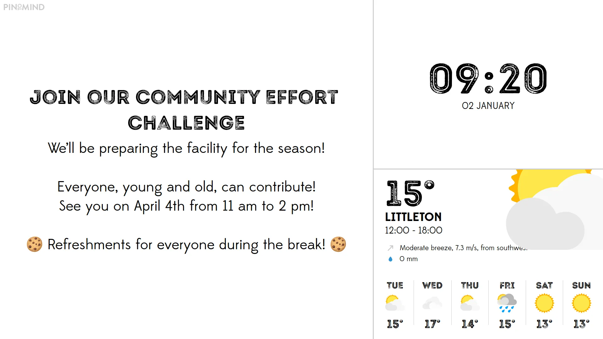
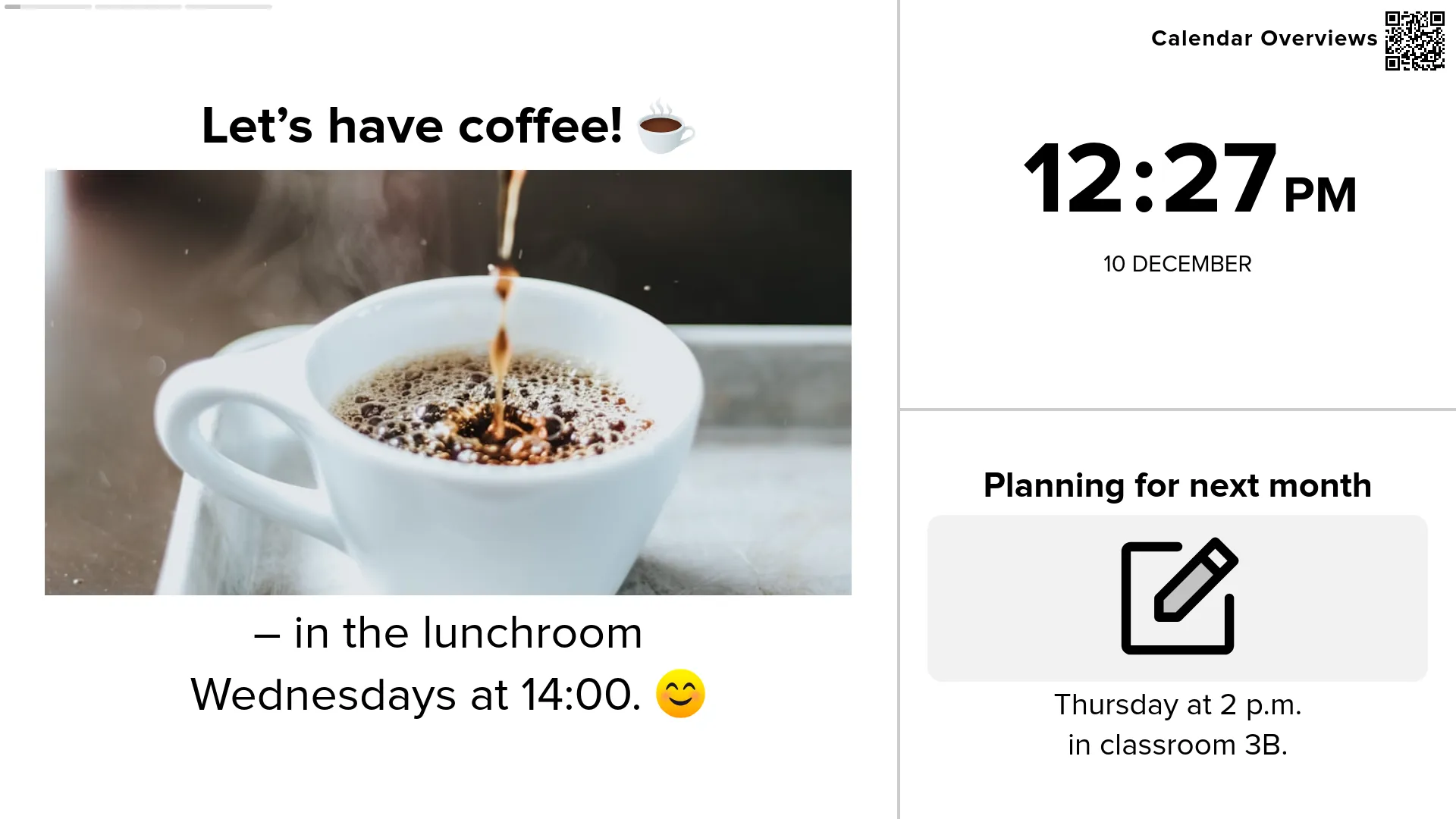
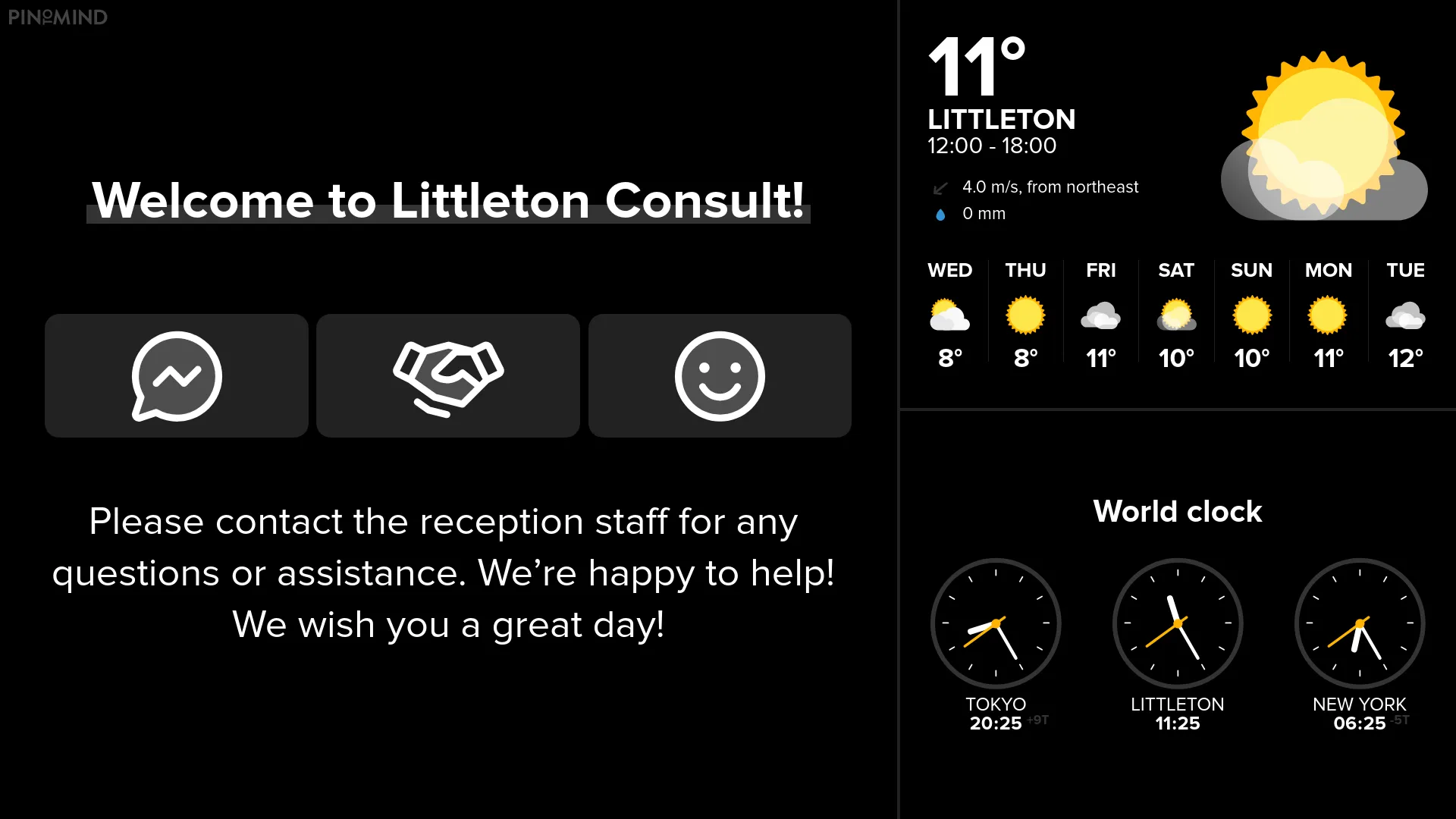
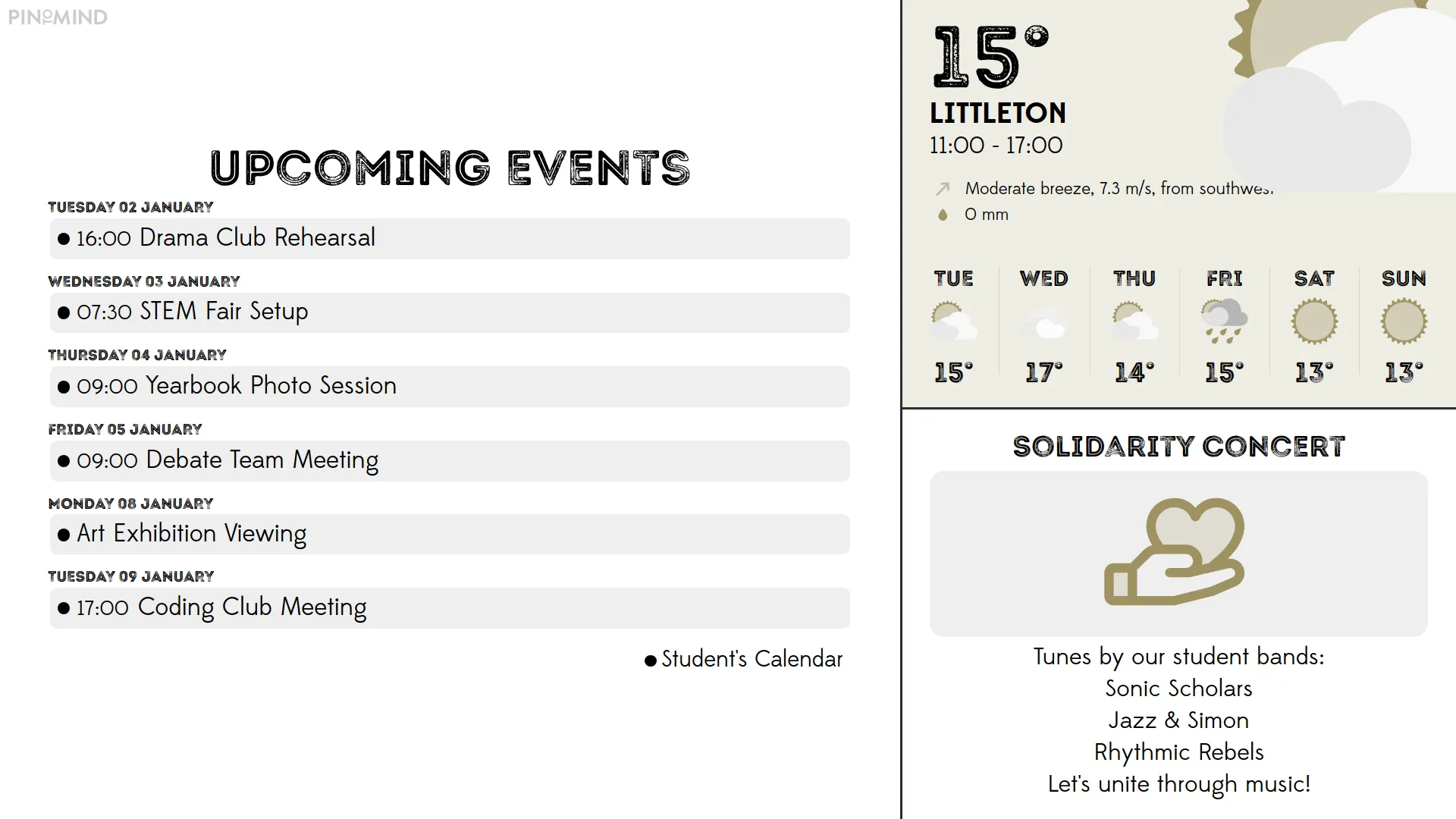
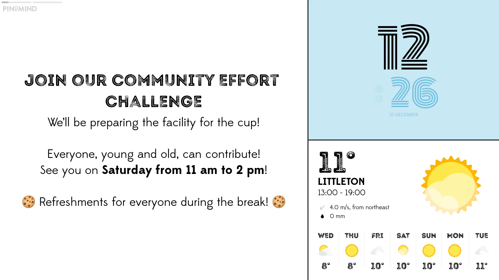
Display different content in multiple areas on the screen simultaneously. You'll find a variety of sleek layouts for both landscape and portrait screens.
Fetch and share content from popular platforms like Google and Microsoft!

Retrieve calendars and display events with our smart Microsoft integration.
Share calendar overviews seamlessly via our integration with Google.
Retrieve and display dashboards and key figures from Power BI.
Share and present calendars and news from here.

We are truly satisfied with PinToMind 3. I find it easier to manage and it offers more options for creating posts based on our needs. It is actually even more user-friendly than before.
Upload images and videos to your account for use and reuse. You can also access royalty-free photos directly from Unsplash and play around with large emojis and icons.
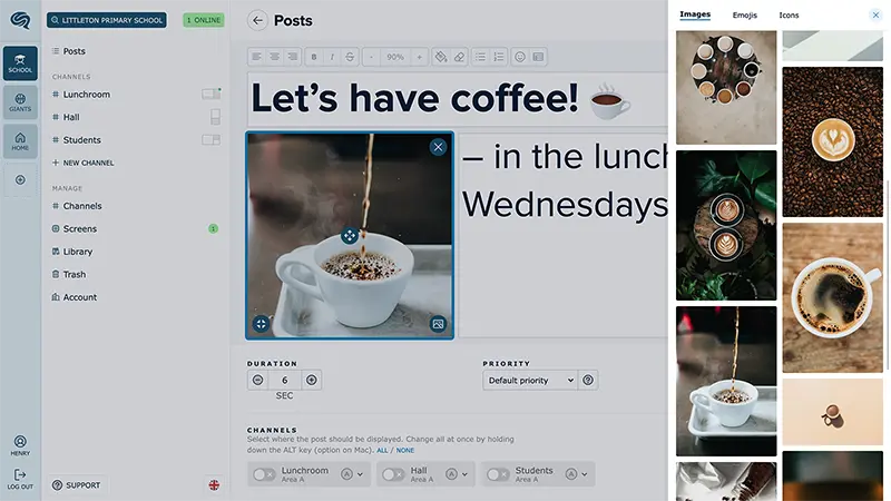
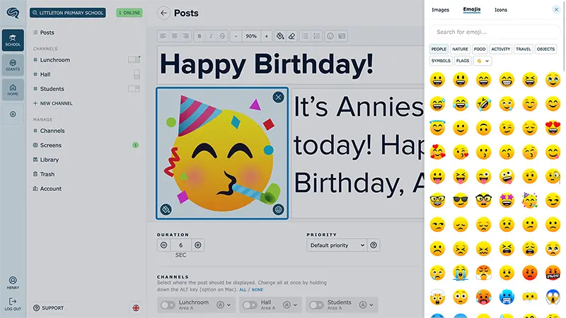
Explore diverse layouts and post options with text, images, and various post types in professional themes. This provides you with incredible flexibility to effectively communicate and convey information.












You can now add text, attachments, and links to posts on PinToMind Go. Share with an open code as before, or invite users via email for full control over access. You can share the same channels as on your screen or create dedicated Go channels.

Keep your audience updated with handy new post templates!

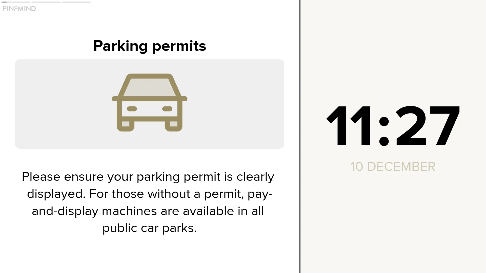
Show current time with a clock post in any area of the screen.
Select locations around the world and display current time simultaneously.

The transition to PinToMind 3 was a smooth experience for us. We have approximately 20 screens and administrators across the municipality, and we haven’t looked back since making the switch. We’re delighted with the new features that PinToMind 3 provides.
Changes appear the moment you save them.

Easy to set start and end dates, and great options for advanced schedules.

What used to be called screens, is referred to as channels in PinToMind 3. A channel is a collection of posts. You can show one channel at a time on a screen. However, you can display the same channel on multiple screens. You can create as many channels as you like, and switching channels is easy. As before, your subscription plan determines on how many screens you can display your content.

We were eager to test PinToMind 3 and quickly discovered it as a significant upgrade from the Classic version. It's still very user friendly but offers many more features, making content creation and management easier. The display design has been significantly upgraded and modernised, giving our screens a very appealing look. Additionally, the user interface has become more streamlined.
We've created stylish themes, templates, and layouts for a professional and polished look!

Add as many users as you want and give them different access based on roles.

We hope you're excited to try the brilliant new PinToMind 3! Just drop us a message — we’ll walk you through everything you need to get going. Or, if you’d rather explore on your own, click the button below.

Get in touch! We 💙 all things digital signage!


